
Introduction
Knowing color relationships is essential when dealing with colors, whether you’re a graphic designer, artist, fashion stylist, interior decorator, or even just choosing paint for your house. In color theory, one of the most often asked questions is:
“What is the opposite color of brown”
It may seem like a simple question, but in order to properly answer it, we must examine how colors interact, how the color wheel defines them, and how perception influences how we perceive opposites.
The actual opposite color of brown, where to find it, and its applications in fashion, design, and aesthetics will all be covered in this comprehensive post.
Also read:https://codionyx.com/telling-stories-through-street-photography/
Knowing the Fundamentals of Color Theory
We must first comprehend color theory, which is a set of principles used to blend colors in a pleasing way, before we can determine the opposite of any given hue.
The Color Wheel
The color wheel, a circular graphic that illustrates the connections between primary, secondary, and tertiary colors, is the central component of color theory.
• The primary colors are yellow, blue, and red.
• Tertiary Colors: Red-orange, Yellow-green, and so on; Secondary Colors: Orange, Green, and Purple (created by combining basic colors).
Colors That Go Well Together
Complementary colors are those that are directly opposite one another on the color wheel. These combinations are utilized to highlight sights and produce the greatest contrast.
For instance:
Yellow ⇄ Purple; Blue ⇄ Orange; and Red ⇄ Green
What role does brown play in this, then?
On the color wheel, where does brown fall?
The fact that brown is not on the conventional color wheel makes things a little more difficult.
Why? Due to the fact that brown is a composite or tertiary hue, it is typically created by combining complementary colors (such as blue and orange), the three primary colors (red, blue, and yellow), or a dark orange (orange and black).
As a result, brown has a warm, dark tone that falls between red, orange, and yellow on the color spectrum, but it is significantly less saturated and bright (value).
Brown is seen as a dark orange in RGB (screen-based color):
• A typical shade of brown is RGB (165, 42, 42).
Therefore, we must determine the complement of dark orange in order to determine the opposite of brown.
So, what is opposite color of brown?
Making use of digital color models such as RGB and HSV and color theory:
A cold blue, more precisely a dark cyan or bluish-teal, is the antithesis of brown.
Why?
If brown is basically dark orange, then dark blue or cyan is its complement. These hues offer the most contrast because they are immediately opposite each other on the color wheel.
Because it strikes a balance between the coolness of blue and the warmth of brown, this color combination works.
Description of Visual Representation
Consider a color wheel:
Depending on the particular shade of brown, it appears as a cold blue or bluish teal directly across from the lower half, which is a muted, earthy orange.
These two work well together to produce a striking contrast in design.
Uses of opposite color of brown in Practice
Now that we know that cool blue/teal is the opposite of brown, let’s examine how this information relates to actual circumstances.
1. Web and Graphic Design
Designers create high-contrast call-to-action buttons by utilizing complementing colors.
Keep visual components in balance and contrast backdrops with typography.
For instance, a teal call-to-action button on a brown background immediately grabs attention.
2. Interior Design
Brown is a popular hue for leather, wooden floors, and furniture. Using cool hues like teal or blue with it:
It balances warm and cool tones, gives spaces a contemporary, revitalizing appearance, and makes them feel larger and cozier.
Example: Teal curtains or cushions on dark hardwood furniture.
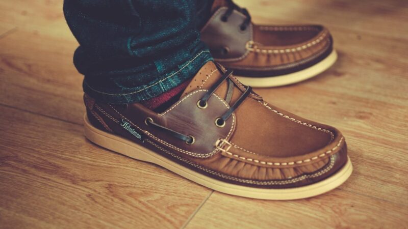
3. Personal Style and Fashion
Color contrast gives clothing depth and appeal. Blue accents combined with brown tones create a chic and elegant look.
An illustration would be a brown leather jacket worn with denim trousers or a teal scarf.
4. Painting and Art
Complementary colors are used by artists to: • Produce depth and shadows; • Make focus areas stand out.
• Make their compositions more tense and moody.
It is possible to replicate natural light, frigid settings, or emotional contrast by using blue to contrast brown.
5. Promotion and Branding
In branding, color psychology is very important. Brown frequently communicates: stability, earthiness, and dependability.
The combination of blue (technology, tranquility, and trust) creates a strong and reliable brand identity.
Example: This combination is used by brands who aim for a “natural yet modern” appeal.
opposite color of brown (Based on Context)
Conversely, the reverse may differ slightly depending on the tone of brown.
Brown in shade Color Opposition (Complement)
Reddish Brown Cyan or Teal
Yellow-colored Brown Violet or Purple
Tan/Light Brown Pale Blue
Brown Chocolate Aquamarine or Sky Blue
These are principles based on perception and contrast rather than strict regulations.
Is White opposite color of brown?
No, although this is a typical misunderstanding.
White, like black and gray, is a neutral or achromatic color; it is not a color complement. White is frequently utilized in minimalist designs with earthy tones or brown wood textures because it contrasts well with brown.
How to Use Digital Tools to Locate Opposite Colors (Including Brown)
When working digitally, if you’re looking for the exact opposite of a particular hue of brown:
Make use of a color wheel or inverter tool:
1. Open any color calculator, such as Coolors or Adobe Color.
2. Type in the hex code for your brown.
3. The complementary (opposite) color will be displayed by the tool.
For instance:
Brown (Hex: #A52A2A) and Teal/Cyan (Hex: #2AA5A5) are complementary colors.
In conclusion
Despite not being on the conventional color wheel, brown is essential to design and aesthetics. Given that brown is basically a dark, subdued orange, we can state with confidence that cool blue, especially in tones like aquamarine, cyan, or teal, is its opposite.
opposite color of brown can be used to produce visually striking and emotionally impactful combinations, whether you’re developing a website, painting a masterpiece, decorating a living space, or organizing an outfit.
In color theory, opposites are about balance as much as contrast. Furthermore, nothing counterbalances brown’s earthy warmth quite like blue’s crisp crispness.
Faqs
1. What hue on the color wheel is brown’s opposite?
Although brown is not on the conventional color wheel, it is the opposite of dark orange, which is teal or dark blue.
2. What color complements brown the most?
Brown contrasts and balances well with cool hues like blue, teal, green, and aqua.
3. Is blue opposite color of brown?
Indeed, according to color theory, cool blues or blue-green tones are the antithesis of brown’s warm undertones.
4. Can I combine blue and brown in a design?
Of course. This combination produces contrast and is frequently utilized in digital art, fashion, branding, and interior design.
5. Does the tint of brown affect which opposite it has?
Indeed. Reddish browns contrast nicely with turquoise or cyan, while lighter browns might go best with pale blues.
6. What Is opposite color of brown of black or white?
No. According to color theory, black and white are neutral hues rather than opposites. They do, however, visually contrast nicely with brown.
7. How can I determine a color’s opposite?
Make use of a digital tool such as Adobe Color or a color wheel. To determine the exact complementary hue of your base color, enter it.